

Data Visualization it’s all about telling your analytics story in the most convincing and straightforward way. Finding the best balance between a good visualization and communicating an idea or result is not an easy job. What I have found is that the most efficient way depends on what your story is about. I am keeping using the term story since a visualization is journey that your audience needs to be part of. Keep in mind that :
- If you need to convey something simple ,make it pretty.
- When a complex idea or result is on the table , make it simple.
- Never overdo it ,”detrend” you visualization based on the context at hand
- Know when to stop adding graphs 😉
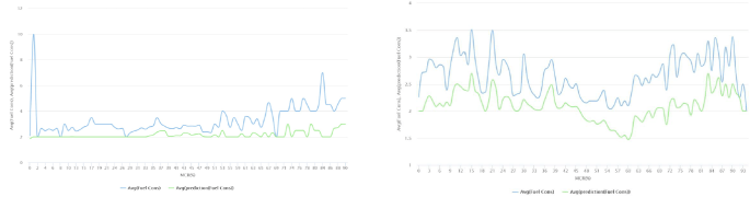
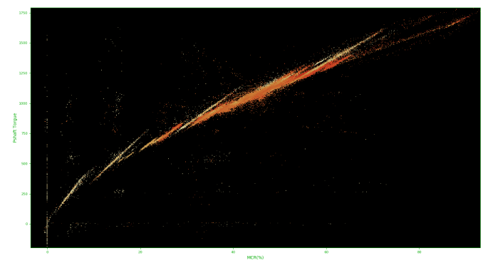
The following examples demonstrate two different cases of analytics results.
In the first case a simple idea of model performance and time series is shown allowing for a more “invested” graph with a lot of room for visual appeal.
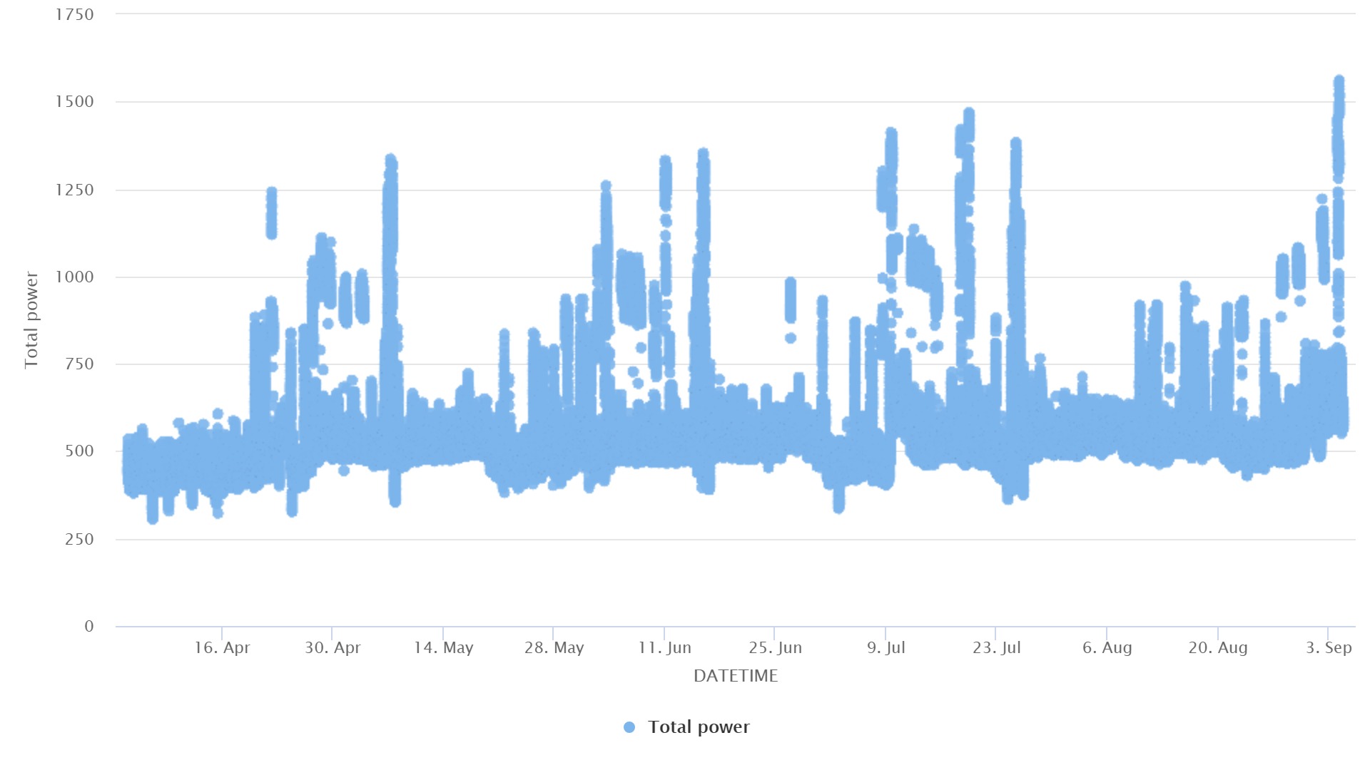
In the second case, a complex observation of a physical system is shown. Accuracy is important in these types of systems so displaying all data points in high detail is important without overdoing it .
On the second part of this piece we will look at the specific ways we can visualize different types of data and the challenges involved.